

Spotify appears to be testing a new UI on Android that will make it easier to navigate your content. The new interface combines Spotify's vast catalog of music and podcasts and includes lists and "grid layouts.".

The redesign was first spotted by Android Police, which provided a screenshot of the new Spotify library. When you're in your library, you'll now see links — playlists, artists, albums, downloads — that will allow you to quickly filter your content. Meanwhile, the playlist creation button has moved to the top right next to the new search button.
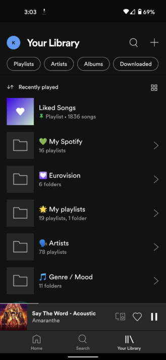
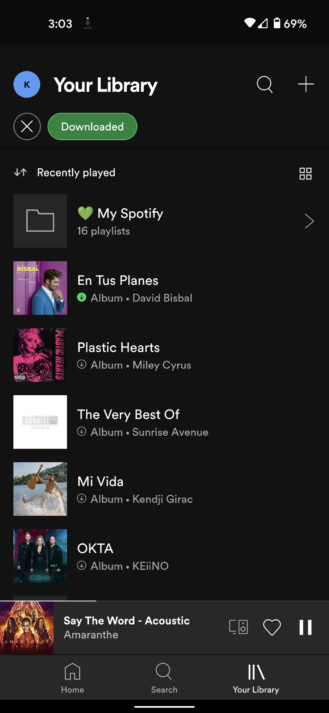
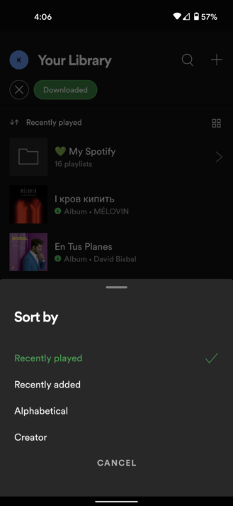
Android Police explains why the new Spotify library UI is an improvement:
What sets it apart from the old design is the grid view for those who prefer a more visual layout, and the aforementioned ability to see everything in one list. In the old design, you had to tap the Filter button next to the search bar and select the Downloads filter, which only applied to the current tab . So if you wanted to see all your offline content, you had to do that for albums, then playlists, and then podcasts. To go back to seeing your entire library, you have to deselect that filter on each tab individually. As you can imagine, this is not a simple process.
The redesign isn't perfect, as Android Police notes. For example, when you use the Downloads filter, the entire folder containing an offline playlist appears in the list. Tapping on it reveals all of its contents, not just the offline playlist.
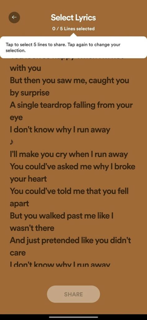
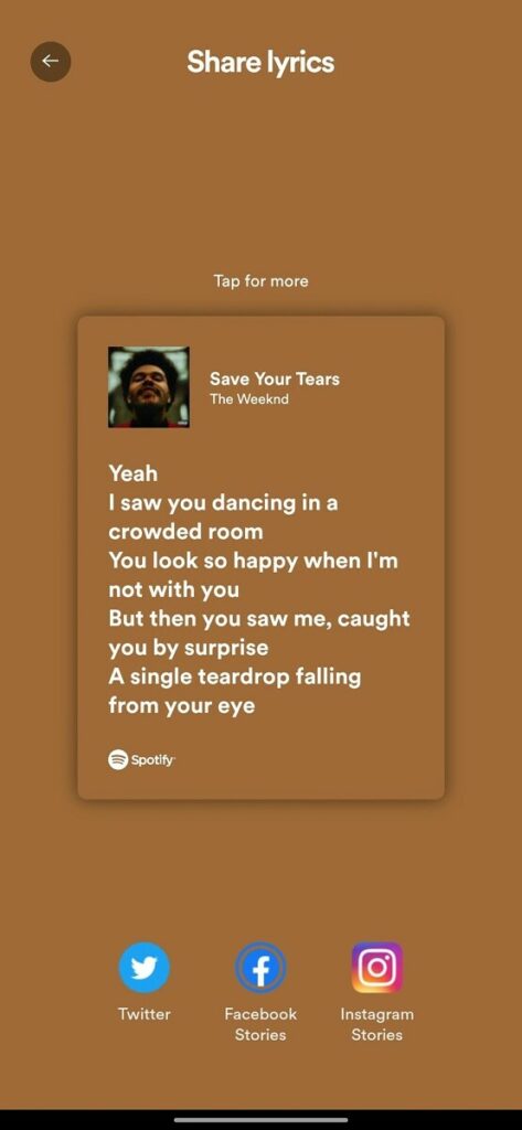
In addition to a new library UI, Spotify appears to be rolling out a feature that will allow users to share lyrics on Twitter, Facebook , and Instagram. So far, users can only share songs on various social networks, not their lyrics.

Information source: xda-developers.com
