

Google turned 19 and below you will see the most popular search engine in the world, through the images available on the Wayback Machine for Google.com from its birth to the present day.
The company was founded in 1998, and although Aerosmith's "I Don't Wanna Miss A Thing" was at the top of the Billboard charts, there wasn't much to see:
This is the original screenshot of Google.com on web.archive.org:
The first real page version of Google.com came later and a new era of text search and soon a silly business name turned into a verb. Google it.
Google in 1999

The year was 2000 and the search engine was no longer in beta.
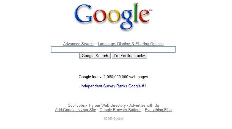
Things didn't change much for a few years until Google went through its "puberty." Check out the font and punk-rock coloring in the 2003 image.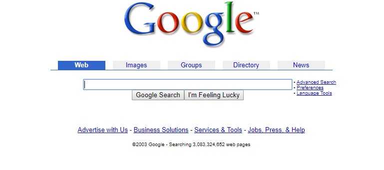
The image above has a strange symbol next to the colorful text "Google." "TM" was added.
Things don't change much for Google.com for the next 7 years. Then out of nowhere, in 2010, it drops the bombshell: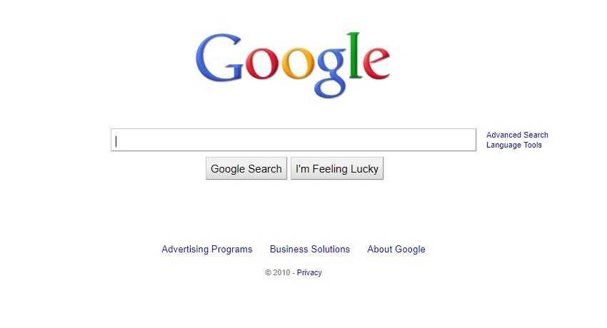
The “radical” redesign shattered preconceived notions that “change cannot be subtle.”.
The beauty of Google.com over the years seems to be its simplicity. The page has always had an abstract line that grew over time.
Evidence;
As you may have noticed, the Keep it simple stupid logic adopted by Arch Linux is also applied well by the largest search engine in existence today.
KISS fits perfectly with Content is the King and Google is undeniable that it has it. So the company doesn't seem to need impressive UIs that capture the visitor's interest.
The Brand Name is completely recognizable, even the homepage uses a simple Verdana font in its logo.
