Few symbols are as important to brand identity as logos!
Apple, Microsoft, Sony! Seeing their logos can trigger an emotional response that connects the user base to their ideals. On the other hand, if not designed properly, logos can make the company look strange.
As tastes and trends change, some brands change their logos to keep up or because they realize it is not representative of the public image they want to portray.
Below you will see some that did not stand the test of time.
Apple
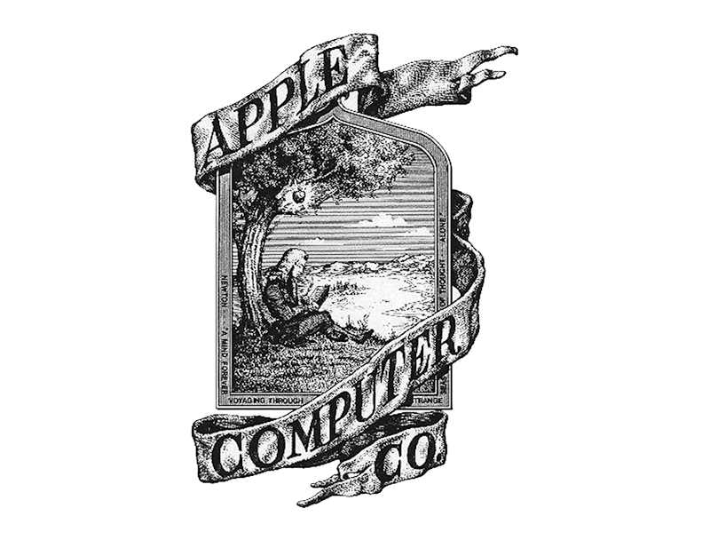
The simplicity that is now synonymous with Apple's brand is absent from this portrait of Newton sitting under an apple tree. The company changed it a year later to a more iconic colored apple, but it remains a part of its history. What's interesting is that the company's name didn't come from Newton's apple, but from a diet by Steve Jobs.
Sony
The font used by Sony is elegant, giving off the same impression as some of its products. The logo used by the company in 1958, however, lost the idea of timelessness in an attempt to be futuristic.
Amazon
Amazon 's original logo lacks the subtlety of the "A to Z" design it has today. Instead, it's a river (or road) leading to an A. The image lasted until 2000, but it's odd that it didn't depict the company's main product at the time, books.
Best Buy
Best Buy started in 1966 under the name “Sound of Music.” The logo looked more like a CD, but at least it matched the product.
Nintendo (1950)

Nintendo for almost a century before Mario came along. Although the company's popularity has skyrocketed over the past three decades, it had humble beginnings as a card company. The logo used from the 1950s to the 1960s shows this.
Logitech

Many of the logos we present are the companies' first attempts. The above was Logitech's third attempt and although it resembles today's logo, it did not stand the test of time
Microsoft
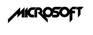
Like Logitech, Microsoft's original logo was pretty good. The one the company used from 1980 to 1982 shows that the company wanted to look cool, as the times demanded.
Wikipedia
Wikipedia , but that has not happened with its logo.