

below map shows the volume of international calls between countries around the world made over the course of a year.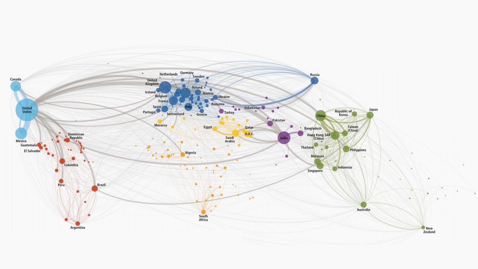
The picture comes from a survey conducted by DHL and entitled “Global Connectedness Index 2014”. This index records the levels of globalization and how they change year by year. One of this year’s conclusions is that global connectivity, which depends on cross-border flows that show the exchanges of products, capital, information and people, has recovered most of the losses it suffered during the financial crisis.
With an analysis of the data resulting from this specific research, one can draw various conclusions. One of them is that 41% of international calls start from developed economies and end in developing ones. The reverse direction is followed by only 9%. In part, this phenomenon can be explained in two ways.
On the one hand, we see which countries immigrants choose more often. For example, see the relationship between the USA and Mexico. On the other hand, in a developed country the cost of international calls is considerably lower than in a developing country. Thus the first group of citizens has more financial comfort to call a relative who belongs to the second group of citizens.
This map, of course, does not reveal how rarely someone makes a phone call to another country. The researchers who created it state that if we add up all the minutes people spend on international calls, we will see that they account for only 3% to 4% of the total time spent on calls.
Here is a different way to represent the data in the map above. Click on the image to see it in higher resolution.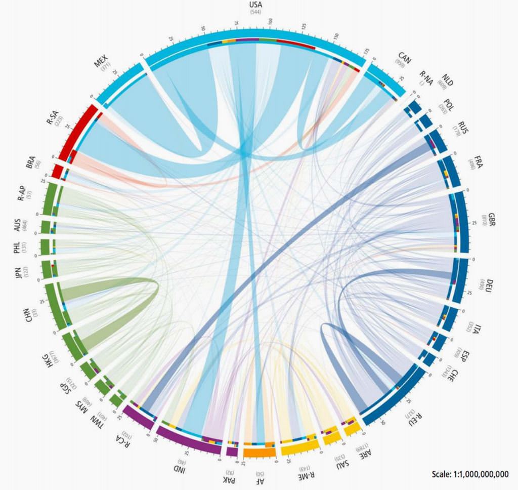
Away.gr
