

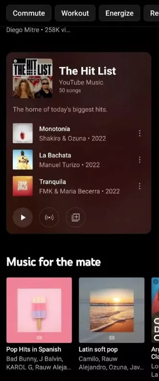
It appears that YouTube Music may roll out a new design for playlists, as they now appear as cards with more information on the home tab. This differs from the way other song groups appear on the home page, so it should make finding and listening to playlists much easier.
See also: YouTube for Android updated with homescreen widgets

9to5Google reports that some users have seen a new design for the YouTube Music home tab, with playlists displayed more prominently. It's unclear how widely the new design is available, as it may still be in beta.
See also: YouTube offers certification to health-related channels
The newly designed app should now display a playlist card in the home feed with a playlist cover in the top left corner, the playlist owner, the song count, and three songs included in the playlist. At the bottom, there are a series of action buttons that allow you to play a song, start the radio, and add a song to your own playlist.
If this rolls out to the public, it will mark a huge step up from the standard home screen tab design, which only displays carousels of album art and artists. With this new layout, you'll be able to see which songs are in a playlist instead of just the artist , making discovery easier . In other words, it breathes life into an otherwise bland home page design.
See also: YouTube will get a new look and additional features
Aiming to compete with the leading music streaming, YouTube Music has made several changes in recent years – one of them is an improved song radio algorithm that helps users find new artists.
Last year, the service also added a playlist discovery feature that recommends a mix of curated and created playlists. You can find these new recommendations at the bottom of your personal playlists.
Information source: androidcentral.com
