Elizabeth Laraki, designer of Google Maps, expresses great disappointment about the new design of the maps on Twitter
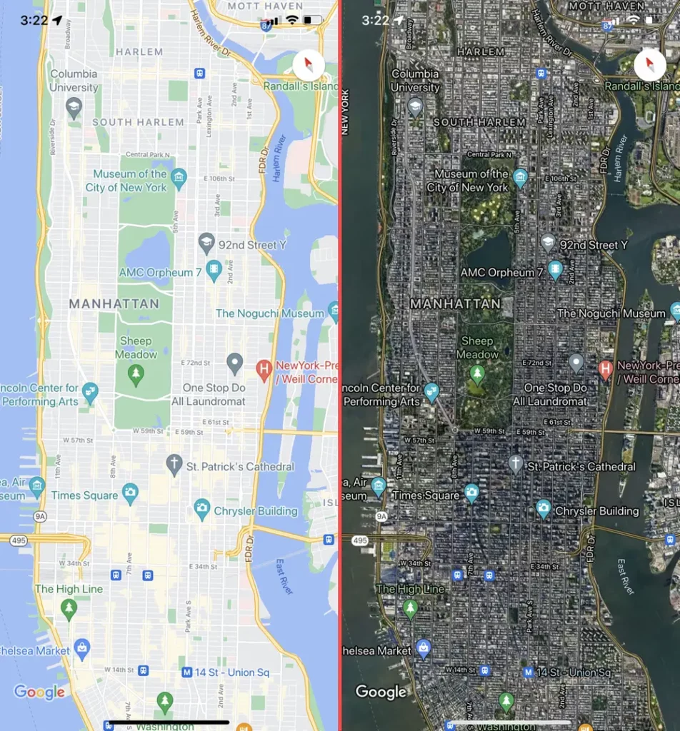
Google recently released a major update to Google Maps, including a major redesign and new AI features. The new color palette for Google Maps is now similar to that of Apple Maps, which is being negatively received by users. It's not necessarily a bad thing, but I understand how long-time Google Maps users will have a hard time adjusting to the new colors. And no, there's no way to go back to the old theme.
See also: Hotel data breach: What conditions did the hackers set?
The new colors have started to be applied more widely, prompting more reviews from users who suddenly found themselves experiencing the new design of Google Maps. Among them is the former Google Maps designer, Elizabeth Laraki, who complained on Twitter/X about the new design of Google Maps.
She wrote an extensive review of Google Maps, complaining mainly about the clutter that affects the user experience of Google Maps, rather than about the color choices.
Color choices
He said that 15 years ago he helped design Google Maps. “I still use it every day. Last week, the team dramatically changed the visual design of the map,” he continued. “I don’t love it. It looks more distant, less precise, and less human. But, more importantly, they could have simplified it and missed the opportunity.”
Laraki highlights the most important color coming to Google Maps:
- All roads are now gray
- The water has turned from blue to turquoise
- Parks and open spaces are now mint green
If you haven't seen the new colors yet, you will notice them soon. It simply means that the Google Maps upgrade has not been applied to your area yet.
See also: Zina in the Evening: How quickly can smart devices be hacked?
The former designer of Google Maps says she sees benefits, recognizing that Google's goal was to improve usability and make the maps more readable. “Honestly, I believe that the main routes, traffic and paths stand out more now”, she said while also complaining about the colder color palette that appears “more computational”.
She also noted that the colors of water and parks/open spaces are blending.
The user interface of Google Maps is getting worse.
Laraki 's main complaint is about the overall Google Maps experience. She said Google missed a "huge opportunity" if the goal was to improve usability. The designer mentioned all the things that sit above the map in Google Maps, making usability a problem:
“So many things have piled up over the map. Currently there are about 11 different elements covering it:
- Search box
- 8 “pills” that overlap in 4 rows
- A prominent card
- A bottom navigation bar
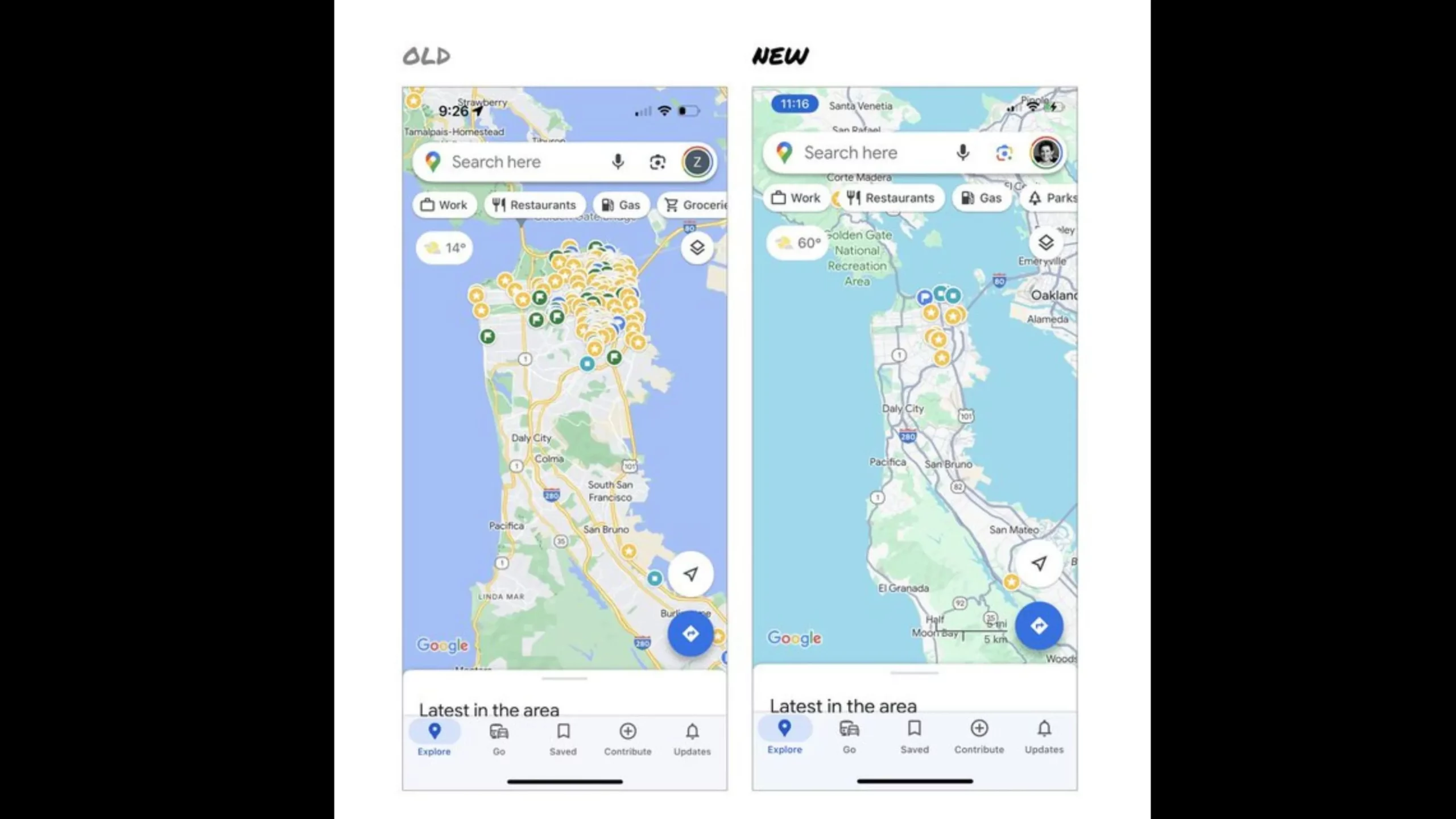
“Personally, I would love to see measurable usage data for all these overlays,” he continued. “The map should be sacred ground. Only things that are of the highest utility to many people should be overlaying it. There should be a very limited number of features that can cover the map. And there are many ways to add new features without overlaying them directly on the map.”
As shown above, Laraki would keep the search box and the bottom bar. But it would move everything else to a redesigned bottom bar.
I must admit that I am in favor of its proposals, and I say this as a Google Maps user who rarely clicks on most of the map overlays.
See also: TransUnion and Experian: Hackers demand 1.1 billion ransom from companies
“I assume that the search box and the instructions are high priority and must remain emphasized,” he said. “But everything else, including location buttons, map layers, nearby parts and other elements, could be placed on the bottom bar.”
The former Google designer acknowledged that it's normal for apps to accumulate features over time. Google Maps is no exception. This happened during her time as a Google Maps designer in 2007, when the app had become a "mess."
We incorporated new capabilities wherever we could find them in the user interface”, he added. The product became increasingly complex and the user suffered. To make the application extensible and simple, we redesigned it.
Laraki believes that it's time for Google Maps to do it again.
Source of information: https://bgr.com